Thursday, December 13, 2012

Graphic Design Today

Here is just a fun example of graphic design today and the capabilities of the computer. It is full of eye catching colors and 3-D effects. One might almost say it it Psychedelic with all the discordant colors. I would like to see someone try to do this with out a computer.

Derek Hess

Although Derek Hess was a part of the "Lowbrow" art movement, in contrast to that typical style, Hess did phenomenally realistic portrayals of the human figure. Also here is a link to some of his sketches on T-shirts: http://www.indiemerch.com/strhess/

Helvetica

After watching a film in Graphic Design History on Helvetica, I now have a new found appreciation for the simpler look of type as well as style. It blew my mind at how passionate some of the typographers were when they were describing Helvetica. One of my favorite descriptions of it was, it is not the letters themselves that make the font, but the space around the letters that make it. I also like how it was said that Helvetica was made not to draw attention to itself, but to serve as a channel to get a message across and nothing more.

Let's Get Physical

"Let's Get Physical" When I saw this, I instantly knew what it was. It is the record album cover art for the Olivia Newton-John's album "Physical." It is interesting to see something made in the early 80s be digitally redesigned in the modern era. 
Here's the music video if anyone wants a listen. 

 http://www.youtube.com/watch?v=vWz9VN40nCA 

I know I will be using this for my New Years Resolution of getting into shape.

Massimo Vignelli


I though Massimo Vignelli embodied the spirit of Helvetica quite nicely. "It just reads that way," is one of his quotes about helvetica, talking about how people can read helvetica just as easy as breathing.

Wednesday, December 5, 2012

A Clock Work Orange

"A Clock Work Orange" is a satirical book about a sadistic, young man named Alex.  The book is  by Anthony Bergess and was very controversial at the time it came out, (1970s)and is still considered quite vulgar today.  The book cover on the left is one that was done in the 70s.  The book cover on the right is my own version.  I wanted to somehow symbolize the description of the title: a clock work meaning no emotion or sympathy and orange referring to a human and their usually soft insides that do have emotion. By saying that it is a clockwork orange, which the main character, Alex is, it is implying the on the inside, Alex is as empathetic as a clock.  I used the orange as the head instead of actual head to show the meaning better.  I also used an clock face as one of the "Os" in the title instead of a gear in a clock for an eye.  Though I thought it was quite clever, it had been done in several other book covers and I wanted to do something different and fresh.  The color scheme I also wanted to be simple and modern, with the bright orange and bulging font the center of attention.  

The Kiss

Monday, December 3, 2012

GD Time-Line

http://farm7.static.flickr.com/6004/5967504471_3850029b84.jpg

I am sorry, but my laptop would not let me insert the image itself so I gave you the link.  The image is a Graphic Design Time-line.  I thought this would be appropriate for end of the semester quickly approaching.  I have learned a lot about the history of Graphic Design and why and how different styles came about, whether it had to do with technological advances of the time or what was valued at the time.

Monday, November 19, 2012

Pop Culture Example


Working at a movie theater, it was inevitable that I would hear about the  final Twilight movie.  Ever since the vampire/werewolf book series came out, there have been copiers and knock-off versions of it.  Such as "Vampire Diaries," ("VP")  a T.V. series that started in 2009.  I admit I watch "Vampire Diaries," and noticed its uncanny similarities to "Twilight;" not just the vampires and werewolves, but the love triangle between a young human girl and two males.

These two images represent the love triangle in both of the stories.  In this example,  the "Twilight" image has the girl in the foreground while the two males are on either side her in the background.  The "VP" one at the top has a more intimate setting, having the characters lying down next to each other, the girl is still centrally place to emphasize the relationship that they have with each another.

I just thought that these images were good examples of modern design to compare and contrast in this digital era as well as be a good example to what is current in pop culture.

Monday, November 12, 2012

Art Gallery Example


I found this piece in the Art Gallery.
For some reason this one speaks to me the most.
Maybe its because it's the only one the I can actually hear the echo of someone yelling against the tiles, as if a vacant memory of the past when the pool was full of water and people.


Lichtenstein


While researching post modernism, I came across a famous Roy Lichtenstein piece that I clearly remember from my childhood being painted on the wall of my old art room in elementary.  So many times I would stare up at the drowning girl wondering what was going on in the painting and the bubble of text beside her and the way she was drawn reminded me of a comic-strip character by. 

After doing some research of Lichtenstein, I now appreciate his work far more than I did before.  Like other postmodern art, there was always criticism on the amount of skill that was involved in making something that was considered art.  But Lichtenstein embraced this "low" art combining a mechanical and hand-drawn reproduction of his work.  Because of the comic-strip style of it, he grew to appreciate the codes and argued that high art and popular were no different, both relied on code for production.  


Monday, November 5, 2012

Modern Prima Donna


This is a modern reinterpretation of a famous painting of the Prima Donna.
I found it in the Graphic Design magazine "Luerzer's Archive."
I had first seen the original version of this in my Art History class so when I saw it in the magazine, I happily made the connection.  I find this piece very witty.  I clothing is modern yet exaggerated for design effect.  The halo around Mary is almost like an incandescent light with a blue up-close of car light background. 

Monday, October 29, 2012

Jeans

 
This is another ad from Lurzer's magazine.  It is to sell different styles of jeans.  I like the dramatic visual affects to describe style of jeans (ignore the lower right-hand corner)  I also like the large, thinly lined type smack dab in the middle of the advertisement.  The consistency of the male model and his positioning was a wise choice to keep a unified look.  What attracted me to this piece was the dramatic setting, almost like a stage. 

Monday, October 22, 2012

Female Doll


   This is one of the ads from Luerzer's Archive.  I  am honestly not sure what it is advertising.  It is a combination of a real model with a live size wooden doll.  The style of the title is a messy lipstick writing, which makes it look spontaneous and gives it personality.  The quality of this piece is amazing.  It truly looks real and is well put together.  The quality of this work is what attracted me to it.

Monday, October 15, 2012

Funkadelic

 
·  Describe what it is: I found this CD cover in a book about different genres and time periods of CD album art.  
·  Describe its function: Album art is to attract the viewer to the CD as well as tell a little bit about the group or indivual artist.   
·  Discuss the style of the design & typography: The style is very eighties, with the afro styled hair, bubble letter typpgraphy and even title, "Funkadelic." 
·  Discuss the quality of the artwork; I think the quality is very well done, having extreme light for drama, but not too extreme and very eye catching subject matter with a emotional expression on the head that is seemingly coming out the ground. 
·  Discuss what attracted you to the piece:  I thought about the Psychedelic age when I saw this album cover, and I just think that it is a good example of it. 

Monday, September 24, 2012

Shelf Arrangement


When I was babysitting, I noticed some shelving in their kitchen that did not have anything particularly useful on it, and it was more for show or decoration.

I imagined it was something to accentuate the theme of the kitchen.

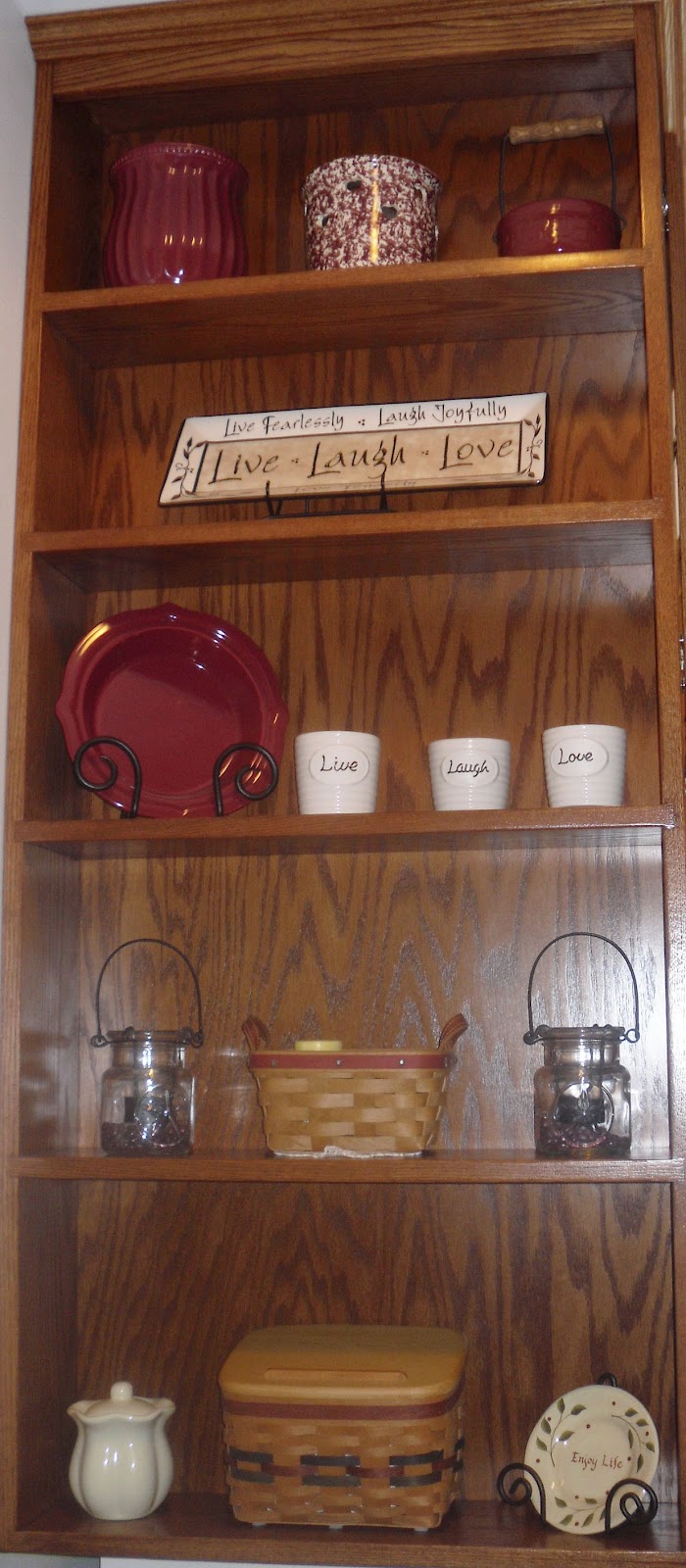
The various vases, cups, plates, and basket have a very homey and warm feel to it mainly using whites, creams, and reds.  The shelf was in the kitchen but the objects are generic enough that they could be placed almost anywhere in a house and would not be out of place.

There is some type on a slab that says, "Live, Laugh, Love," which is a common, modern saying in America and promotes living a happy life.  Th positioning of the of objects are well balanced which is what attracted me to the set up of it.  Or rather, what attracted me to it was that fact that the balance of the objects on the shelf strongly relates to arranging objects to create balance on a webpage or a poster that a graphic designer would do.

Therefore, I discovered that an interior decorator and a graphic designer have similar problems to solve when it comes to visual appeal, whatever they are working with. Seems that design can be found in more places than I thought.

some words I would use to describe the decoration set up on the shelves would be warm, calm, classic, traditional, conservative, and orderly.

Monday, September 17, 2012


This is the cover art for the anime movie, "Howl's Moving Castle," by Hayao Miyazaki.
The function is to attract the viewer to watch the movie and buy it in stores.
I saw the movie when I was visiting my friends house but I had seen the movie before.
The portion of the cover I focused on does not have any type, but two faces that are large and very expressive.
Miyazaki's film's, including story and art, are award winning and I find his drawing style to be minimal but charmingly effective.
I love facial expressions and the faces are very large in scale so I was quickly able to notice the fear you can see in the girl's eyes and mouth and the certainty you see in the man's

Monday, September 10, 2012

American Museum of Immigration

This is a poster advertising the American Museum of Immigration. 

Its function is to attract the public to come the museum.

I found it in a book called "Posters, American Style."

The typography is stylistically slanted to create interest.  The same white color and even spacing and positioning of each word or word group gives it unity, as does the simple, rich blue background.  The less vibrant sixteen models of the statue of liberty complement the blue nicely and are expertly coordinated based on their position and especially color.   While at the same time, it seems as thought they have been grouped haphazardly.

I think the quality of the work is crisp and yet interesting, the words I would describe it with from the vocabulary wheel would be calm, orderly, and fresh.

What attracted me to the piece is the similar colors of the statues being grouped together.  The painting class that I took has made me more sensitive to colors and how they relate to each other.  

Monday, September 3, 2012

Album Art Fat Boys


This is a album art cover released in 1985 for the group call "Fat Boys."  The purpose of this visual composition is to catch the viewer's attention purchase the CD.

After looking through a couple of books filled with graphic design examples, I found this particular album cover art in a book called "The Book of Hip Hop" by Andrew Emry.

The style has simple composition and uses subject matter more than anything else to create interest.  Having playfully positioned the artists with their backs turned away from the camera to play on the album title "The Fat Boys are Back."

The typography is cleverly done, combining the title of the album and the name of the group.  The title is separated by the font and color, using bold, blue color and looks like the meaning of the words.  I had tried to find out what that is called. It might be called onomableva.  

The artwork is subtlety dated with the clothing style and the font, but overall it is relatively a classic look. It is composed on a plain white background and uses a black and white color scheme mixed with two complementary colors.  This is a simple, yet bold look and is very eye catching, hence why it is a classic.

What initially drew me to the cover was the humor and playfulness of the group having their backs turned to accentuate the name of their album as well as their large size. 
  
Words that I would choose from the vocabulary wheel for this example of graphic design are playful, bold, fresh, casual, and fun.