Monday, October 29, 2012

Jeans

 
This is another ad from Lurzer's magazine.  It is to sell different styles of jeans.  I like the dramatic visual affects to describe style of jeans (ignore the lower right-hand corner)  I also like the large, thinly lined type smack dab in the middle of the advertisement.  The consistency of the male model and his positioning was a wise choice to keep a unified look.  What attracted me to this piece was the dramatic setting, almost like a stage. 

Monday, October 22, 2012

Female Doll


   This is one of the ads from Luerzer's Archive.  I  am honestly not sure what it is advertising.  It is a combination of a real model with a live size wooden doll.  The style of the title is a messy lipstick writing, which makes it look spontaneous and gives it personality.  The quality of this piece is amazing.  It truly looks real and is well put together.  The quality of this work is what attracted me to it.

Monday, October 15, 2012

Funkadelic

 
·  Describe what it is: I found this CD cover in a book about different genres and time periods of CD album art.  
·  Describe its function: Album art is to attract the viewer to the CD as well as tell a little bit about the group or indivual artist.   
·  Discuss the style of the design & typography: The style is very eighties, with the afro styled hair, bubble letter typpgraphy and even title, "Funkadelic." 
·  Discuss the quality of the artwork; I think the quality is very well done, having extreme light for drama, but not too extreme and very eye catching subject matter with a emotional expression on the head that is seemingly coming out the ground. 
·  Discuss what attracted you to the piece:  I thought about the Psychedelic age when I saw this album cover, and I just think that it is a good example of it. 

Monday, September 24, 2012

Shelf Arrangement


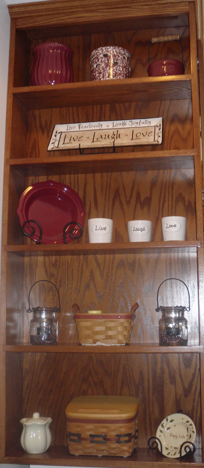
When I was babysitting, I noticed some shelving in their kitchen that did not have anything particularly useful on it, and it was more for show or decoration.

I imagined it was something to accentuate the theme of the kitchen.

The various vases, cups, plates, and basket have a very homey and warm feel to it mainly using whites, creams, and reds.  The shelf was in the kitchen but the objects are generic enough that they could be placed almost anywhere in a house and would not be out of place.

There is some type on a slab that says, "Live, Laugh, Love," which is a common, modern saying in America and promotes living a happy life.  Th positioning of the of objects are well balanced which is what attracted me to the set up of it.  Or rather, what attracted me to it was that fact that the balance of the objects on the shelf strongly relates to arranging objects to create balance on a webpage or a poster that a graphic designer would do.

Therefore, I discovered that an interior decorator and a graphic designer have similar problems to solve when it comes to visual appeal, whatever they are working with. Seems that design can be found in more places than I thought.

some words I would use to describe the decoration set up on the shelves would be warm, calm, classic, traditional, conservative, and orderly.

Monday, September 17, 2012


This is the cover art for the anime movie, "Howl's Moving Castle," by Hayao Miyazaki.
The function is to attract the viewer to watch the movie and buy it in stores.
I saw the movie when I was visiting my friends house but I had seen the movie before.
The portion of the cover I focused on does not have any type, but two faces that are large and very expressive.
Miyazaki's film's, including story and art, are award winning and I find his drawing style to be minimal but charmingly effective.
I love facial expressions and the faces are very large in scale so I was quickly able to notice the fear you can see in the girl's eyes and mouth and the certainty you see in the man's

Monday, September 10, 2012

American Museum of Immigration

This is a poster advertising the American Museum of Immigration. 

Its function is to attract the public to come the museum.

I found it in a book called "Posters, American Style."

The typography is stylistically slanted to create interest.  The same white color and even spacing and positioning of each word or word group gives it unity, as does the simple, rich blue background.  The less vibrant sixteen models of the statue of liberty complement the blue nicely and are expertly coordinated based on their position and especially color.   While at the same time, it seems as thought they have been grouped haphazardly.

I think the quality of the work is crisp and yet interesting, the words I would describe it with from the vocabulary wheel would be calm, orderly, and fresh.

What attracted me to the piece is the similar colors of the statues being grouped together.  The painting class that I took has made me more sensitive to colors and how they relate to each other.